Apple today announced a massive new update to macOS at the WWDC 2020 event — macOS Big Sur. The new OS update comes with new design changes that try to reduce “visual complexity.”
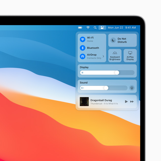
Right of the bat, there are several big changes on the desktop. There is a new Control Center next to the Notifications bar, where users can easily change brightness, sound, and more.
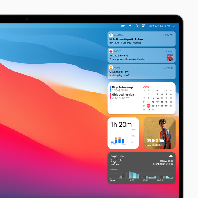
The notifications now arrive in bundles where the user can easily remove a group of notifications in one click. Apart from that, there are new iOS 14-like resizable widgets that can be added to the notification bar.
With the new macOS update, Apple has removed visual clutter and made it more minimalist. For instance, the menu bar is now more translucent. There are big changes to the macOS apps as well.
The finder app is completely revamped and has become more intuitive. Other than that, there are design changes to the Calendar app, Podcast app, Apple Music, Apple Maps, Photos, and several others.
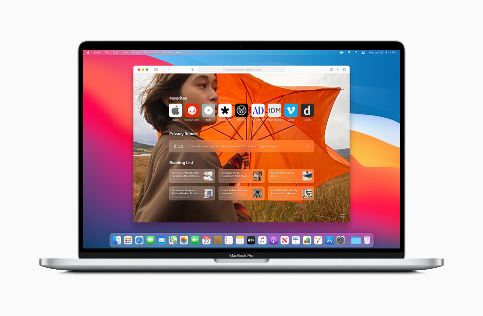
Another big change is in the Safari app that will come with macOS Big Sur. Users can now customize the home page with a background image and separate sections such as a Reading list or iCloud Tabs. There is also a new privacy report that shows how the browser is protecting users against the websites’ data collection practices.
Last but not least, Apple has also made big changes to the iMessage app and the Maps app. Similar to iOS 14, users can pin messages and customize Memojis on the Mac itself.
macOS Big Sur beta is available to developers starting today, and the public beta will arrive next month. Meanwhile, the stable update will land on Macbooks in fall 2020.
In other news, Apple has announced new custom chips that will be running the next generation macs. Follow our Apple WWDC 2020 to know more.
The post macOS ‘Big Sur’ Arrives With Major Design Changes, A New Control Center appeared first on Fossbytes.
macOS ‘Big Sur’ Arrives With Major Design Changes, A New Control Center
read more

No comments:
Post a Comment